

ROLE: UX/UI DESIGNER
TIMEFRAME: 5 DAYS UX + 5 DAYS UI DESIGN SPRINT
TOOLS: PEN&PAPER, POST-ITS, IDEAS, NOTION, SKETCH, MARVEL, FLINTO, ANIMA APP
BRIEF: DESIGN A DIGITAL WELLNESS PRODUCT THAT TRACKS USERS’ PROGRESS AND PUSHES THEM TO A HEALTHIER LIFESTYLE
August, 2018
APPY MAKES YOU AND KEEPS YOU HAPPY!
ux challenge
There is a misconception that people work to become more successful and only then they can become happy. But researches show that people should first feel happy in their life and then it will lead them to success at work or in other aspects of their life. People;
need a way to focus on their happy moments or memories.
need a way to spend more time with their loved ones because sharing makes people happier.
need a way to remember their happy moments.
How might we train our brains to become happier?
ux solution
An app where people interact in a closed group of friends or family on a horizontal timeline. Throughout the day they upload a picture, an emoji, or a text on their timeline. If someone uploads an unhappy emoji, the app would recognize it and it would remind them of a happy memory (a picture on the database of the app; either a picture uploaded earlier or a picture imported from other social media accounts). People load ‘diamonds’ to the pictures, and the pics with more diamonds (most precious memories) would be reminded more often. People also react to others’ logs; i.e. send them an encouraging message.
the process
MARKET analysis

After the initial hypothesis and analysis of some academic researches done about happiness, I did a competitive analysis. To determine my competitors I checked digital solutions that have the purpose of keeping people happy. Either a mood tracking app, a journal or even Facebook memories were in my scope. I analyzed them for several aspects and finally to determine my digital product's point of difference, I analyzed them on a Market Positioning Map for 3 key points; visuals, app ratings, and percentage of free usage.
USER RESEARCH


To get quantitative answers I did a survey focusing to ask WHAT, WHY, HOW, and WHERE questions to get good insights on my problem. I conducted it via Google Forms and got 40 answers over a night. I also interviewed 6 people to have more qualitative answers. When I analyzed the answers, I saw that both the survey and the interview insights aligned.
ANALYSIS PROCESS: I first put all of my user research findings on an Affinity Map. I analyzed them under 2 super headers.
Why? — as of why people feel unhappy?
How to Solve? — as to how do people currently cope with this feeling.
Alone. (Concrete & Abstract Solutions)
With People. (Concrete & Abstract Solutions)
persona
BRAINSTORMING & IDEATION


My user research results and my analysis helped me create my persona. I also tried to give her very specific traits, like Charlotte The Mood Swinger that are easy to remember because from this point on she would be the key person for my design. I believe a persona who is easy to remember would help a lot through a design process.
USER JOURNEY
![[Wellness] - User Journey | Muge.JPG](https://images.squarespace-cdn.com/content/v1/5b75466c7e3c3a0b14b3c47e/1539591103937-PZUGXTQGIH1REQYUTRMH/%5BWellness%5D+-+User+Journey+%7C+Muge.JPG)
A user journey made really sense to my project as Charlotte had very specific happy/unhappy moments throughout the day. It depended on where she was at and with whom she was. The unhappy moments were usually work-related; when she was commuting to work or when she was at work, those were the opportunity moments for me to communicate with her, to put her mood back on.
I did two Crazy 8 brainstorming sessions to ideate my findings with my classmates and by myself. To analyze the results of these sessions I sketched a Mind Map and then asked my classmates to vote on the ideas they preferred. Finally, 3 main ideas were favorited: Timeline, Random Picture Reminder, and Sad Emoji Recognizer.
moscow method

To define these essential features on the MVP, I used the MOSCOW prioritization tool with a Kanban board on Notion app. I also sorted out User Stories to make sure the Must-Have features fits with the MVP.
LOW FIDELITY WIREFRAMES AND USER TESTS


Here are the low-fidelity wireframes. I made 2 versions of them and 2 sets of user tests. First, I tested with 6 people. The tester mostly struggled to find out how to check the timelines. They expressed they needed signifiers/arrows to right and left to understand the swiping effect. However, I wanted to keep the visuals simple and I tried adding five instructional onboarding screens. They worked well on the second testing phase.
MID FIDELITY WIREFRAME

As it is seen on overall the main screen is composed of only horizontal timelines, log bubbles (for pictures, texts, emojis, and location sharing), and the menu button as a plus sign. I tried to keep the layout as simple as possible with every element isolated enough to keep a good proportion of whitespace and simplicity.
VISUAL BENCHMARK

While forming my mood board, I simultaneously did a benchmark to analyze competitors’ visuals. To differentiate, my app should have a colorful, cool, and fun interface with lots of breathing white space.
ATOMIC DESIGN
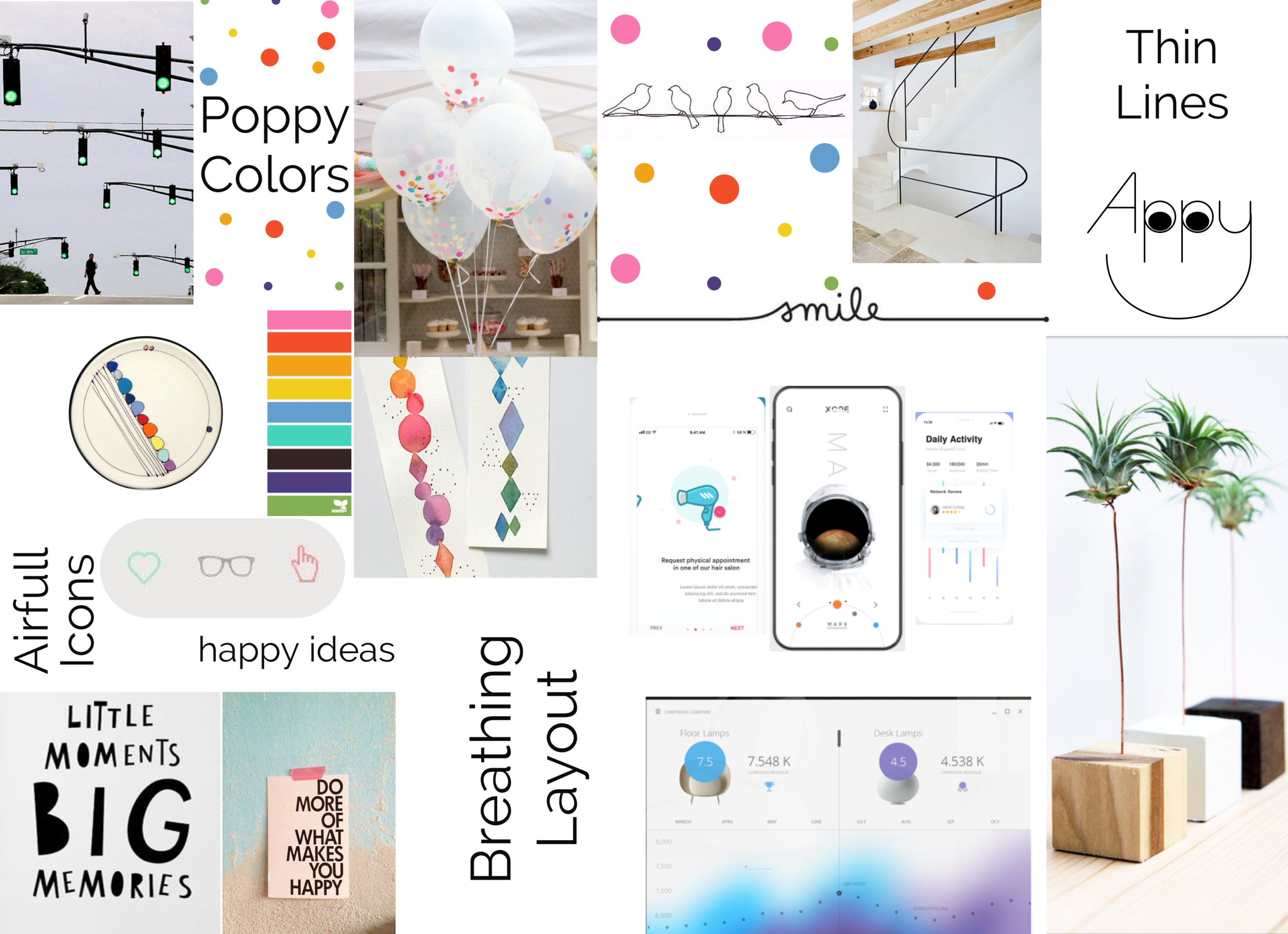


My style tile is composed of 9 main colors. For texts, I wanted to use these colors as well but they didn’t pass the contrast ratio test, that’s why I used dark grey for all texts in the app.
I included basic geometric shapes on my style tile out of which I first created a pattern (you can see just below the color circles) and then had the idea to use these shapes on the timelines, where each shape would represent a specific log.
For typography, I chose to use a sans serif font with thin strokes; Raleway. Another reason for this typography was the fun and joyful movement of its number of characters. I will use a lot of numbers to state the timing on the timeline and Raleway would give them a joyful personality.
the OUTCOME

First, the app starts with the onboarding screens to teach about how to interact in the app. And then I had 3 main user flows:
Take a picture and upload it to the timeline.
Interact with Lucie, she seems sad. Send her a kiss emoji.
Upload a sad emoji to your timeline and see what happens.


Animation made on Anima app. This is an empty state page; it will most probably appear when the user logs in for the first time and there is no one on his/her list.
LEARNINGS
I learned to listen to the users at every single chance because the insights they are giving may lead to interesting decisions about my product. In this project, I had the ‘like’ feature for pictures. The picture that had more likes were appearing more often as reminders. However, one incident during my user tests made me think of this feature more in detail. A tester didn’t feel very comfortable liking a picture of herself while uploading it to her timeline; it made her feel arrogant. I explained to her that it wasn’t about liking the picture itself but was more about the specific memory. But when I thought about it later, actually the main idea was that our memories are very precious to us. The happiest ones are the most precious ones. So we are not ‘liking’ them in this sense, but we are claiming that they are ‘precious’. That’s how I came up with the diamond shape and sparkles instead of conventional hearts. The sparkling diamonds then became the key moment where the users smiled during tests.
APPENDIX
Read about the full process on my medium post here for the UX and here for the UI process.